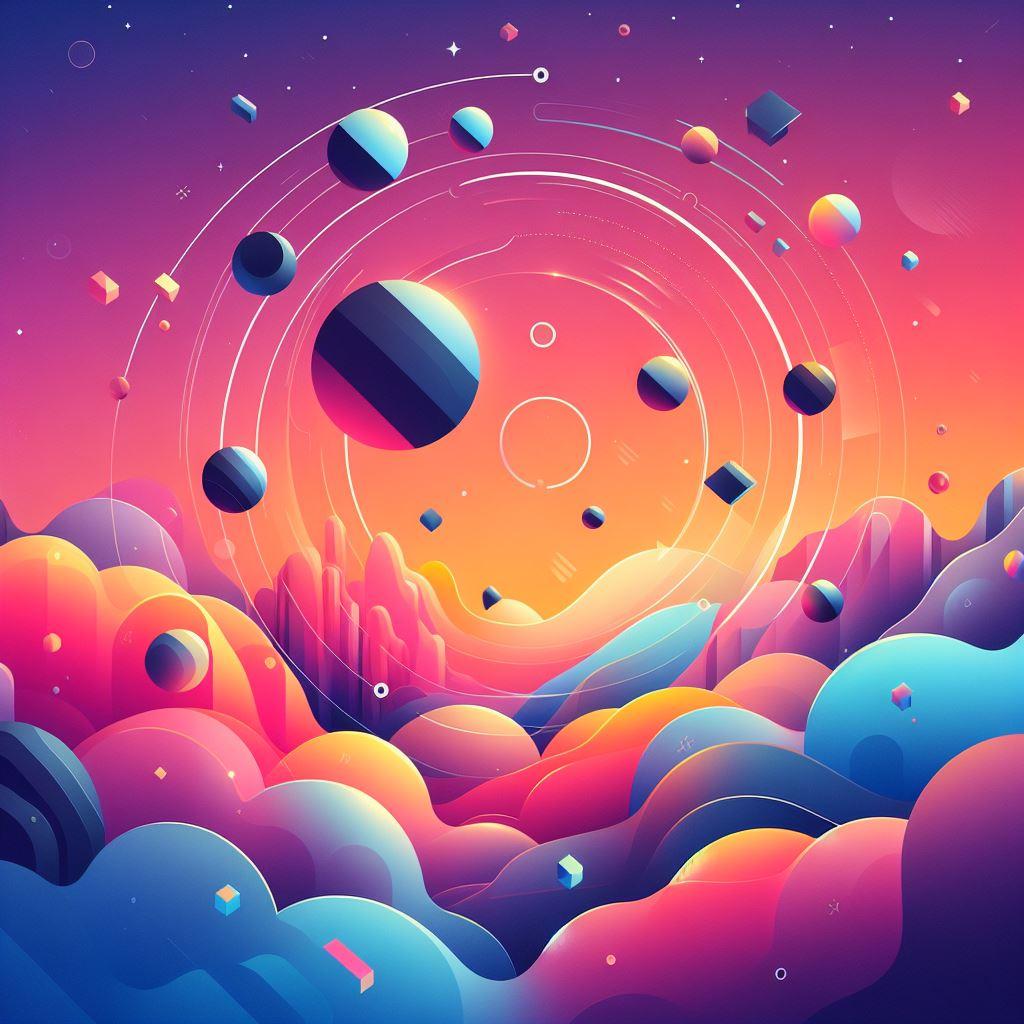
Creating an animated CSS background
Creating an animated CSS background can add visual interest and dynamism to a webpage. Here's a simple example of how you can create an animated background using CSS:
<!DOCTYPE html>
<html lang="en">
<head>
<meta charset="UTF-8">
<meta name="viewport" content="width=device-width, initial-scale=1.0">
<title>Animated Background</title>
<style>
  body {
    margin: 0;
    padding: 0;
    overflow: hidden; /* to prevent scrollbars */
    animation: color-change 10s infinite alternate; /* adjust timing as needed */
  }

  @keyframes color-change {
    0% {
      background-color: #ffcccc; /* start color */
    }
    100% {
      background-color: #ccccff; /* end color */
    }
  }
</style>
</head>
<body>
  <!-- Your content goes here -->
</body>
</html>
In this example:
We've defined a simple HTML structure with a <body> element.
In the CSS:
We set margin and padding of the body to 0 to ensure the animation covers the entire viewport.
We set overflow: hidden to prevent scrollbars.
We defined a keyframe animation named color-change that changes the background color from #ffcccc to #ccccff over 10 seconds. The infinite keyword makes the animation loop indefinitely, and alternate makes it alternate direction on each cycle.
You can customize this example by adjusting the animation properties (duration, timing function, etc.) and the CSS properties being animated. For instance, you can replace the background color animation with other properties like gradients, transformations, or even background images for more complex effects.
Creating a Star Wars-inspired animation with CSS can be a fun project! How about an animation of the iconic opening crawl text? Here's a simple example to get you started:
HTML:
<!DOCTYPE html>
<html lang="en">
<head>
  <meta charset="UTF-8">
  <meta name="viewport" content="width=device-width, initial-scale=1.0">
  <title>Star Wars Opening Crawl</title>
  <link rel="stylesheet" href="styles.css">
</head>
<body>
  <div class="opening-crawl">
    <p>Episode IV</p>
    <h1>A New Hope</h1>
    <p>It is a period of civil war. Rebel spaceships, striking from a hidden base, have won their first victory against the evil Galactic Empire.</p>
  </div>
</body>
</html>
CSS (styles.css):
body {
  background-color: black;
  color: yellow;
  font-family: 'Arial', sans-serif;
  overflow: hidden;
}

.opening-crawl {
  position: absolute;
  top: 50%;
  left: 50%;
  transform: translate(-50%, -50%);
  width: 80%;
  text-align: center;
  animation: crawl 60s linear forwards;
}

.opening-crawl p, .opening-crawl h1 {
  margin: 0;
}

@keyframes crawl {
  0% {
    transform: translate(-50%, -50%) translateY(100%);
  }
  100% {
    transform: translate(-50%, -50%) translateY(-800%);
  }
}
This code will create a simple Star Wars opening crawl animation. Feel free to customize it further to match your vision! You can adjust the text, font, colors, and animation duration to suit your preferences.
.jpg)
.jpg)

© borntobrowse.com